The problem
Senior residents have different needs from junior ones. Junior residents are learning the basic steps of procedures — Touch Surgery already handled that well. Senior residents are working out the nuances: why one technique gives better outcomes than another, how a specific attending approaches a procedure, what to do when something doesn't go to plan. None of that was being served by the existing product.
To understand what they actually needed, I spent the early months of the project doing immersive research. I read everything I could find on surgical education and went back through the work previous designers had done, looking for gaps. Then I started interviewing residents and attending surgeons in the field, and observing them in the operating room.
The night-before-a-case finding
The clearest insight came from the interviews. Senior residents told me they spent significant time on YouTube the night before a procedure, searching for relevant videos to prepare. If a resident had three hours to prepare for a case the next day, they could spend up to two and a half of those hours just trying to find a credible, high-quality video. The actual learning got squeezed into the last thirty minutes.
Quick discoverability of trustworthy advanced content was the real user need. The residents needed a way to get to the right video, from a surgeon they trusted, fast.
That sentence ended up being the test for every later decision. If a feature didn't make trustworthy video faster to reach, it wasn't an MVP feature.
What I designed
The product had to do a lot of things. One of the harder parts was working out which things to leave out.
Defining the MVP
Touch Surgery had a strong reputation for high production-value content, but for the senior resident audience we couldn't realistically build that ourselves at the volume needed. The product had to lean on the surgical community itself — letting attending surgeons upload and annotate their own videos, so residents could learn the specific techniques used by the people training them.
That context set the constraint for the MVP:
Private channels per institution
So content stayed within trusted networks — a resident at one program saw the techniques used at that program.
Video upload by verified surgeons
Identity and credentials checked at the institution level, so the source of any given video was always knowable.
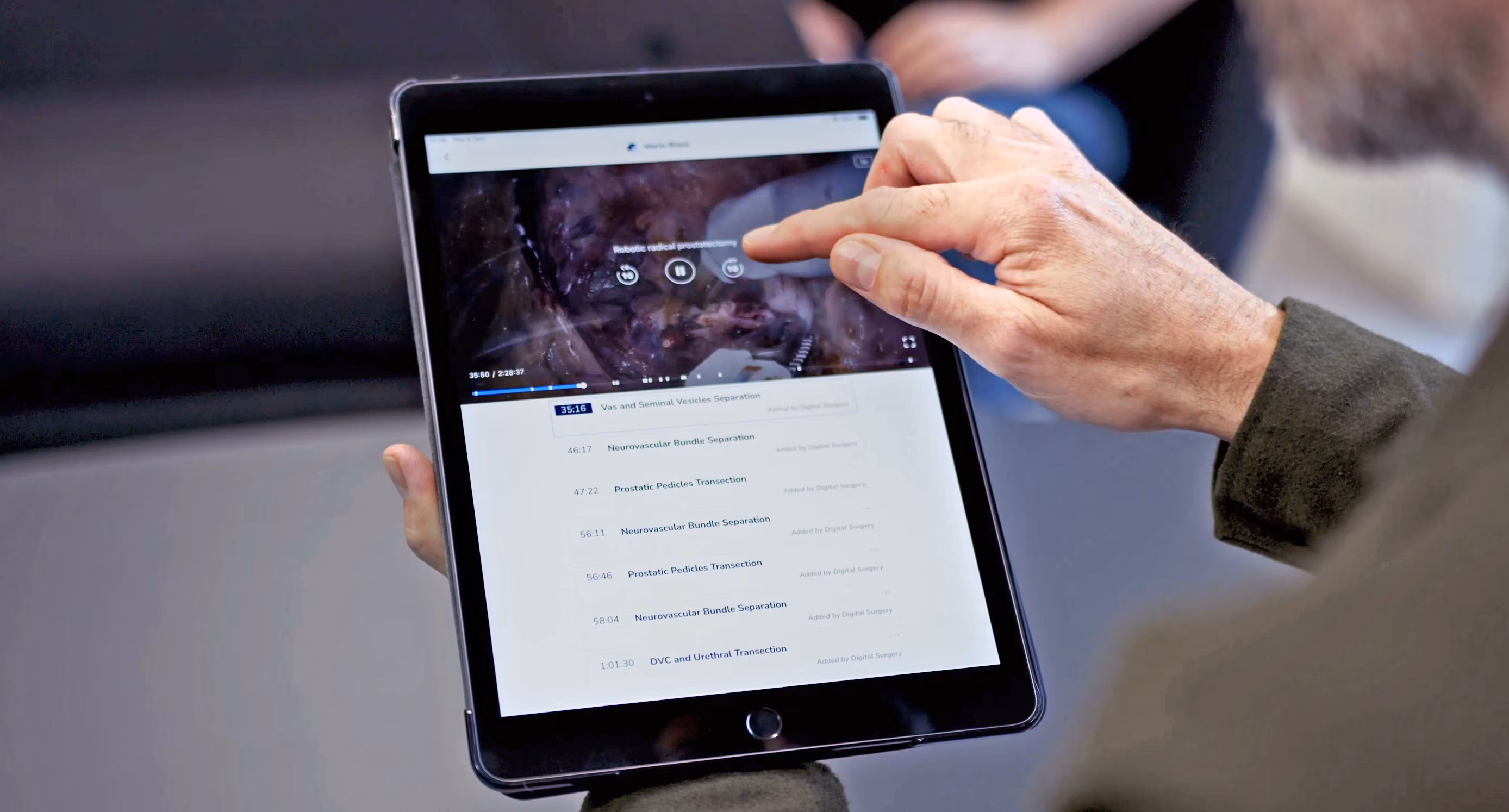
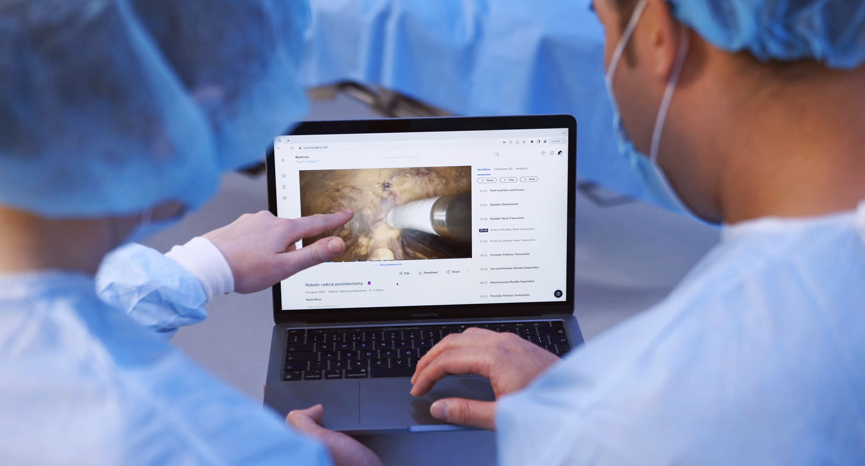
Time-stamped annotations
Marked up onto the surgical workflow, so a resident could jump straight to the moment in the procedure they needed.
Video assessments
A lightweight way for attendings to track whether a resident had actually engaged with the content they'd been assigned.
Everything else — leaderboards, social features, recommendation engines, integration with formal evaluation processes — got pushed out of scope. There were strong arguments for many of them, but the team kept coming back to the same point: surgeons have almost no time, and the only way the product would be used was if it was fast and obviously useful from the first session.
The video annotation flow
The annotation feature took the most iteration to get right. Surgeons needed to mark up moments in a video — surgical workflow steps, key objectives, tips, complications — and residents needed to find and jump to those moments easily. The flow went through many rounds of prototyping and testing with surgeons over the course of the project; three of those rounds shifted the design enough to be worth telling the story through. What follows is those three turning points — not the full sequence.
Three turning points


Discoverability beats density. Each version had more information than the last on paper, but the version that worked best was the one where the information was easiest to act on.
The system underneath
The annotation flow was the most visible piece, but it sat on top of a more complex system: surgeons creating content as authors, surgeons consuming it as viewers, and the same person often switching between both roles depending on the procedure.
I built out the user flow for the author experience, mapping every state a piece of content could be in — draft, published, hidden, edited — and every action a surgeon could take from each state. Each branch had its own success messages, undo behaviours, and edge cases.

The flow doesn't look like much on its own, but it surfaced important conversations. What should happen if a surgeon hides a published note that residents have already seen? What does an undo mean after a delete? How should draft and published states differ visually? Addressing these questions early helped the build go smoothly once we got to engineering.
How I worked
I went into surgical residency programs in the US and UK to interview residents and attendings, observe procedures in the operating room, and run testing sessions on prototypes as they developed.
Sitting in a theatre for a four-hour procedure tells you things no remote interview can — the rhythm of the team, where the attending pauses to teach, how questions get asked. A lot of the design decisions that ended up in the product came out of conversations on the way out of the OR rather than in formal sessions.
Sketching the admin view
Alongside the resident-facing product, programs needed a way to see how their residents were progressing. I sketched the admin dashboard on paper before taking it anywhere near Figma — cheaper to throw out, easier to talk through with program directors and academic coordinators in the room.

The team around it
Inside the team, I worked closely with engineering and medical educators. Engineers were involved in design conversations from early on, which meant by the time we got to spec'ing the build the work was familiar to them. The medical educators were a different kind of partner: their job was to push back when something looked clean on screen but didn't reflect how surgical training actually worked.
The hierarchy that shaped the product
The hierarchy of surgical training shaped a lot of product decisions. Program directors set what residents needed to learn, attendings did the teaching, residents did the learning, and academic coordinators kept the whole thing running. Each group had different needs from the product, and not all of them were on the same side. A feature that helped residents learn faster wasn't automatically a feature that program directors wanted to approve.
Working out who needed to say yes to each part of the product, and what they each needed to see to get there, was a smaller part of the work but probably the most important.
Outcome
Early feedback from the surgeons using it focused on two things. The first was how quickly residents could find the specific moment in a video they needed — the searching problem the project had set out to solve. The second was something we hadn't designed for explicitly: attendings using the platform to capture their own teaching — something they'd never had a tool for before.
Looking back, the thing that stays with me is how much immersion mattered. Surgical education is specialised, hierarchy-bound, and time-poor — there was no shortcut to understanding it. The research ran the whole length of the project, and most of the design decisions that worked were the ones tied closely to something a surgeon had said in an interview, or done in front of me in a theatre.