The problem
As the catalogue grew, so did buyer hesitation. Every purchase carried real cost and operational consequences, but the interface wasn't helping people feel sure they'd picked the right thing.
A lot of buyers were contacting support just for reassurance, even when their order was technically fine. With the catalogue growing, that was only going to get worse. Three things were driving this:
Search results weren't helping buyers compare.
The original product tiles showed very little information — not enough to narrow options down without clicking into each one. Buyers were ping-ponging between tiles and detail pages, and couldn't filter on the things that actually mattered when sourcing packaging at scale.
Listing pages had no clear structure.
Information had been added over time without much hierarchy. Buyers trying to work out whether a product was right for them didn't know where to look first or what they could safely ignore.
Checkout kept asking questions buyers had already answered.
Instead of confirming what they'd chosen, the checkout flow re-presented fields and options from earlier in the journey. That made people second-guess themselves at the worst possible moment.
All of this meant the support team was doing the job the product should have been doing — reassuring buyers and helping them through purchases.
What I designed
The core of the work was deciding what information buyers needed at each stage of the journey, and making sure they got it at the right time.
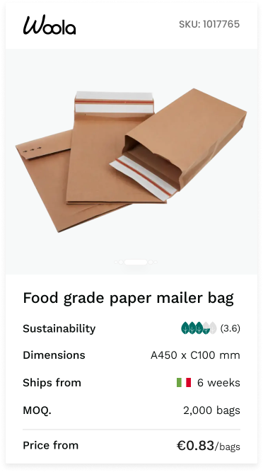
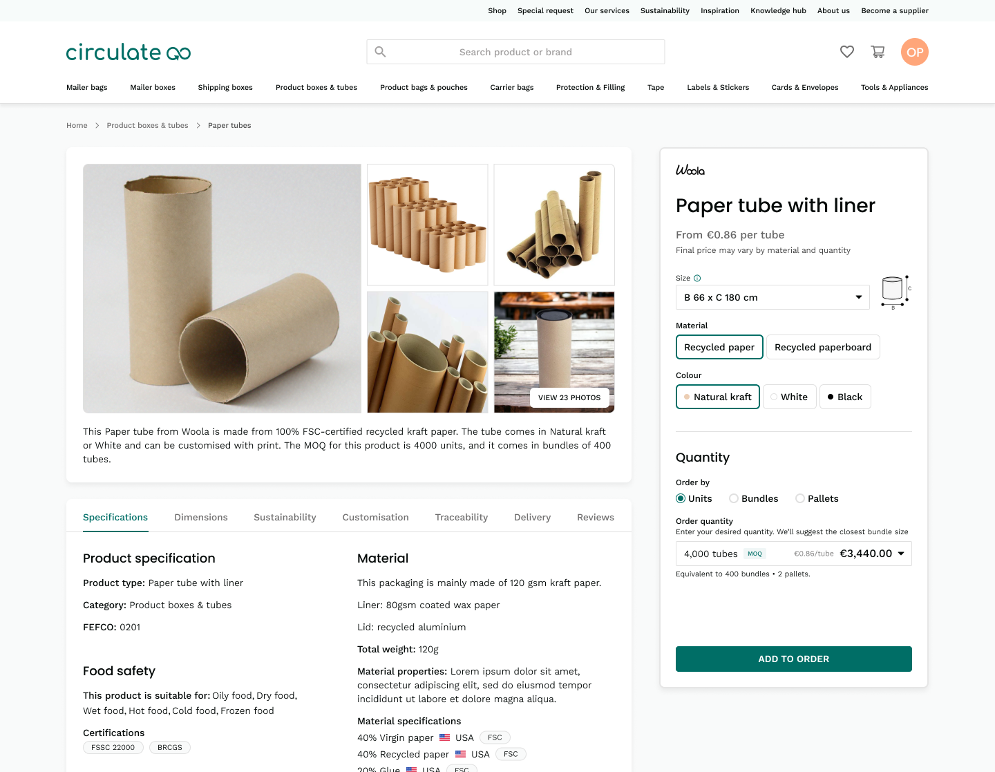
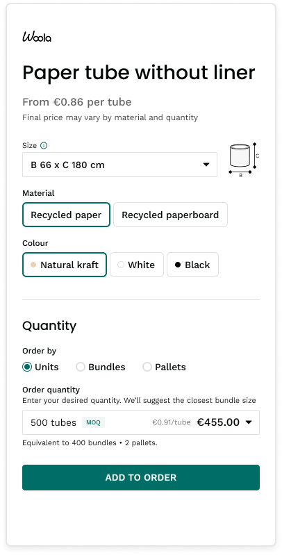
Search results
Search was where buyers made their first decision — is this product worth looking at? But the original tiles didn't give people enough information to make that call without clicking through every option.
I ran a short round of interviews and usability tests with active buyers to work out which attributes mattered when they were comparing products, and which filters belonged in the sidebar. A clear shortlist emerged: sustainability rating, minimum order quantity, lead time, country of origin, and dimensions. That's what went on the tile. Everything else could wait until the listing page.

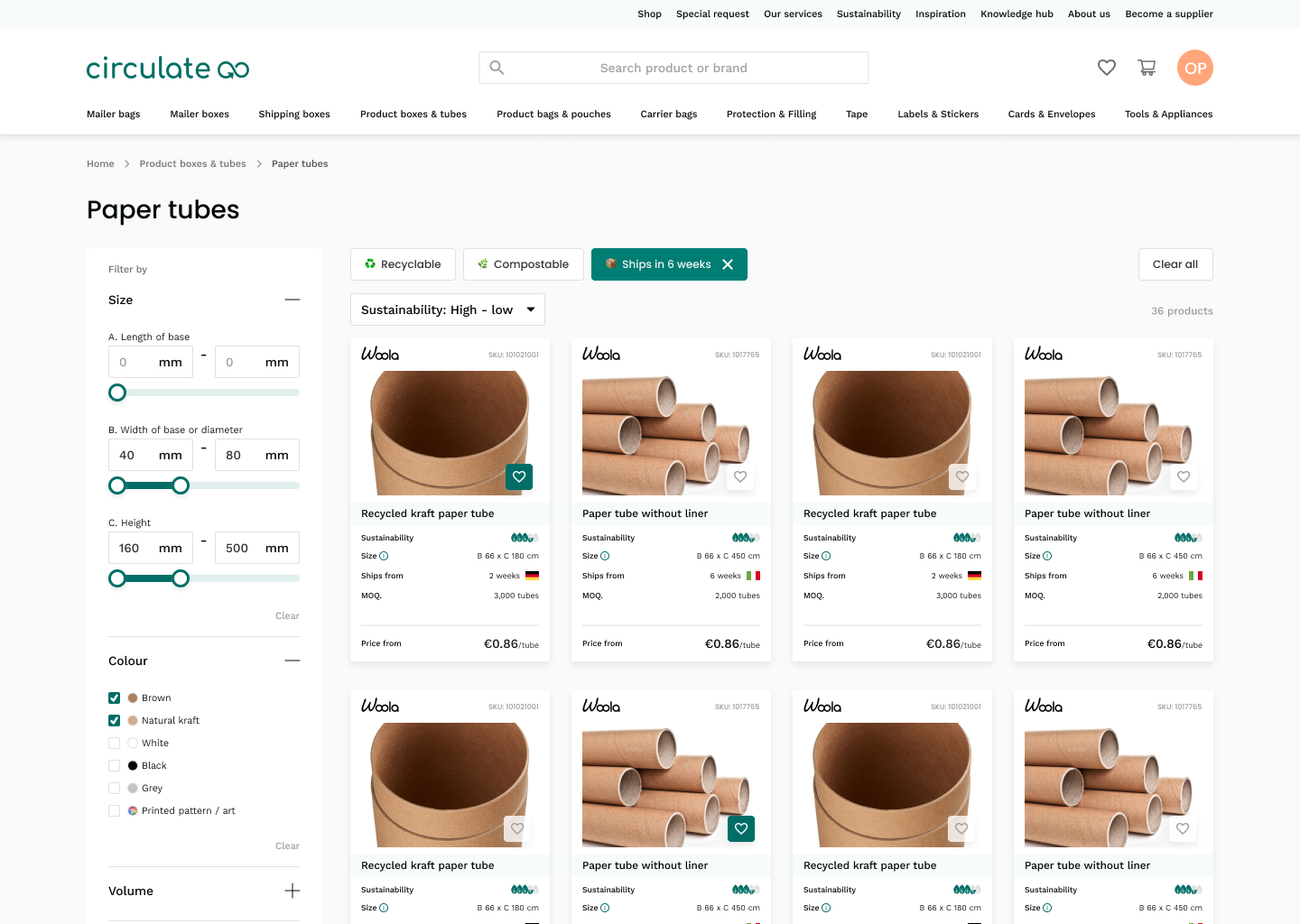
Listing pages
The listings had grown organically and it showed. Specs, descriptions, pricing, sustainability info was all there, but not in any particular order. Experienced buyers couldn't find what they needed quickly, and newer buyers didn't know what to prioritise.
I reorganised each listing into sections that moved from the essentials (what is this, what does it cost, when can I get it) into progressively more detailed specs. Someone who knows exactly what they're looking for can get in and out fast. Someone who's less sure can keep scrolling and find the answers to their questions in a logical sequence.
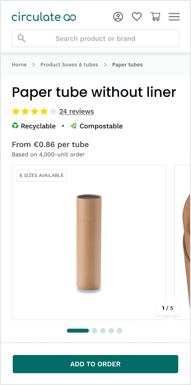
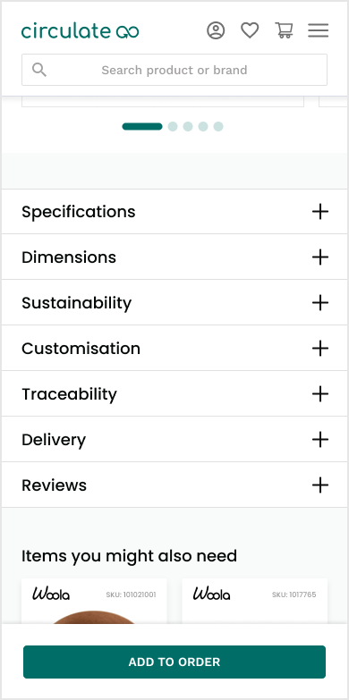
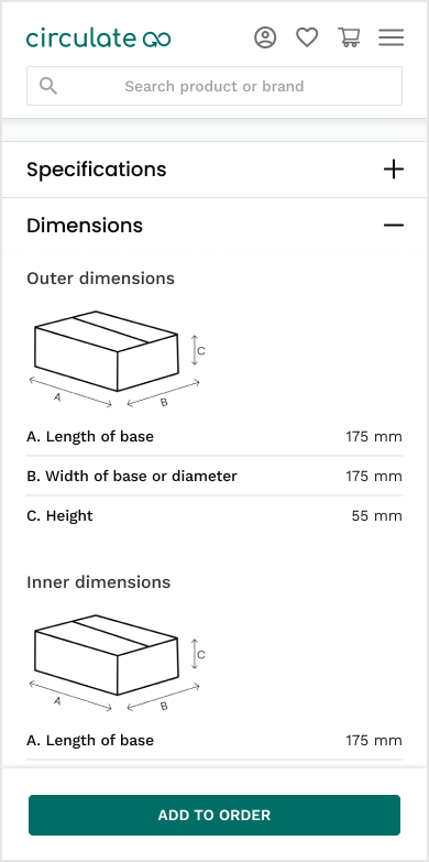
The mobile listing — essentials up top, progressively more detail as you scroll. Sections collapse so experienced buyers can skip ahead.
Checkout
This was where the most damage was happening. Buyers had already made their decisions during search and on the listing page, but checkout was effectively asking them to make those decisions again. Fields reappeared, options were re-presented, and there was nothing confirming that what they'd chosen earlier was still correct.
I redesigned it as a multi-step flow where each step shows only what's relevant at that point. Inputs are validated as you go, so you know immediately if something doesn't work. And the final review step pulls everything together so you can see your full order before committing.
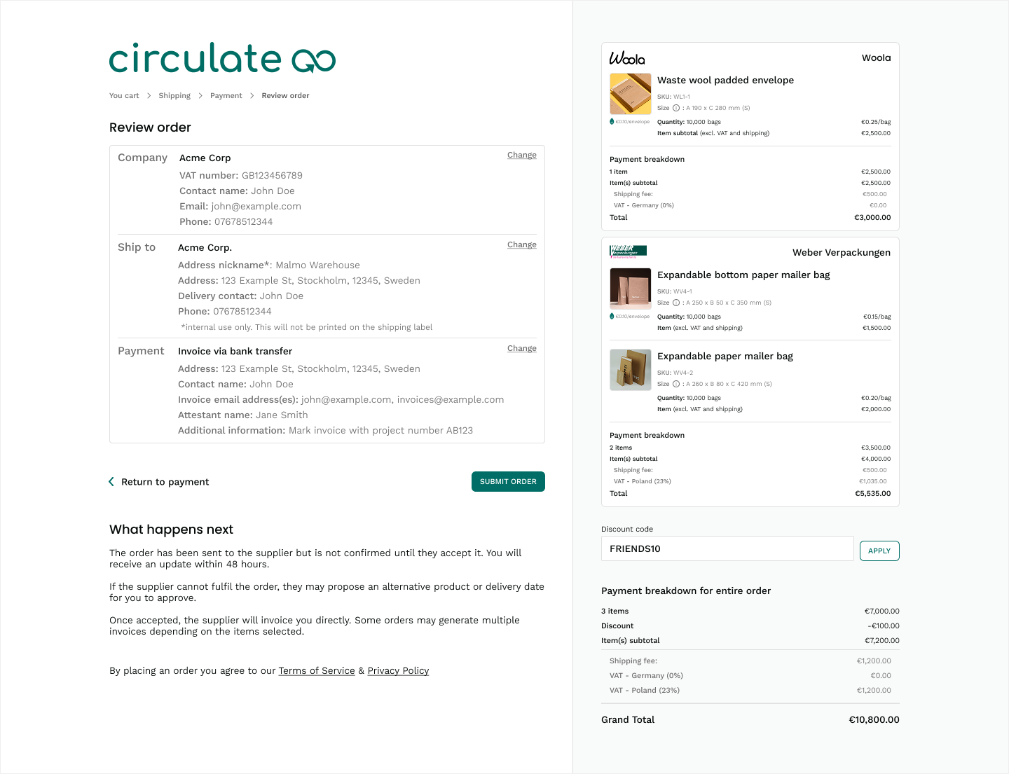
The whole flow is live as a prototype. circulate-prototype.lovable.app ↗
Handling edge cases and restrictions
Packaging products have constraints — not every combination of material, size, and print method is possible, and some suppliers can't fulfil certain configurations. Previously, buyers would discover this late in the process (or not at all, leading to failed orders).
I built rules into the interface so that when a combination wasn't available, the system told you why and pointed you toward what would work. Visually it's small detail, but it made a big difference to how confident people felt using the product without hand-holding from the team.
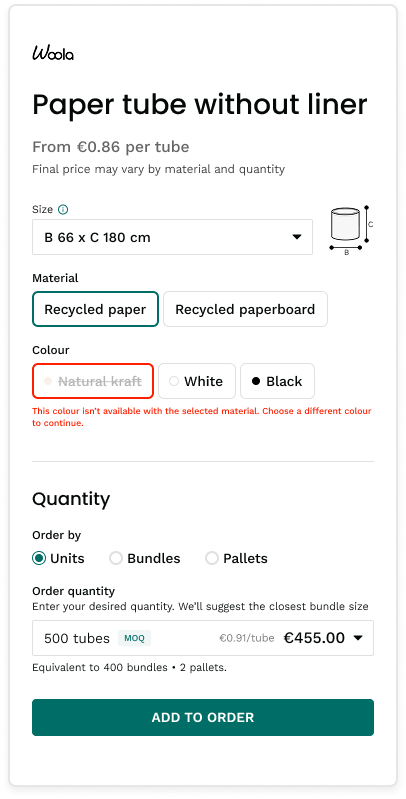
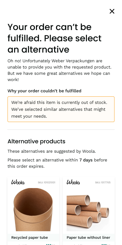
Small interactions — a validated field, a helpful modal, a suggested alternative — doing the work that support used to do.
How I worked
With the founder
The founder was close to the product and getting constant feedback from buyers, suppliers, and the support team, but a lot of it was contradictory. My job was to filter that noise and keep our decisions tied to what the data and user behaviour were actually showing. We had to have a few honest conversations about where adding more information was actually making things worse, not better.
Within Sharetribe's constraints
Circulate is built on Sharetribe, so I was working within an existing component system and data model. I got engineering involved early to understand what was flexible and what wasn't. We reused existing patterns where they worked, extended them where we needed to, and sequenced the whole thing so we could ship improvements incrementally, which mattered for keeping momentum through a planned founder absence.
Impact
Buyers started completing purchases more independently. The checkout flow in particular changed how people moved through the product — fewer hesitations, fewer trips back to the listing page mid-flow, and a noticeable shift in support's day-to-day from reassurance work to higher-value queries.