Overview
PilatesPass had reached a point where adding new booking formats was becoming expensive in terms build time and operational cost.
Each new service type introduced slightly different booking logic, one-off UI patterns and additional edge cases for engineering to support. Individually, these decisions made sense, but collectively, it meant the system was harder to maintain and extend, and felt inconsistent for users.
The business needed a booking system that could enable the team to add new formats without fragmenting.
The problem
After an analysis of the booking process, I found three issues affecting the user experience and the team’s ability to scale:
Multiple booking flows solving the same problem
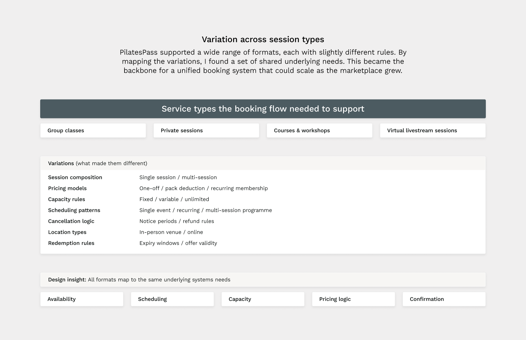
Group classes, private sessions, courses and workshops each followed different booking paths, despite sharing most of the same underlying logic. Engineering were maintaining several versions of essentially the same flow, increasing effort and risk with every change.
Inconsistent patterns reduced predictability
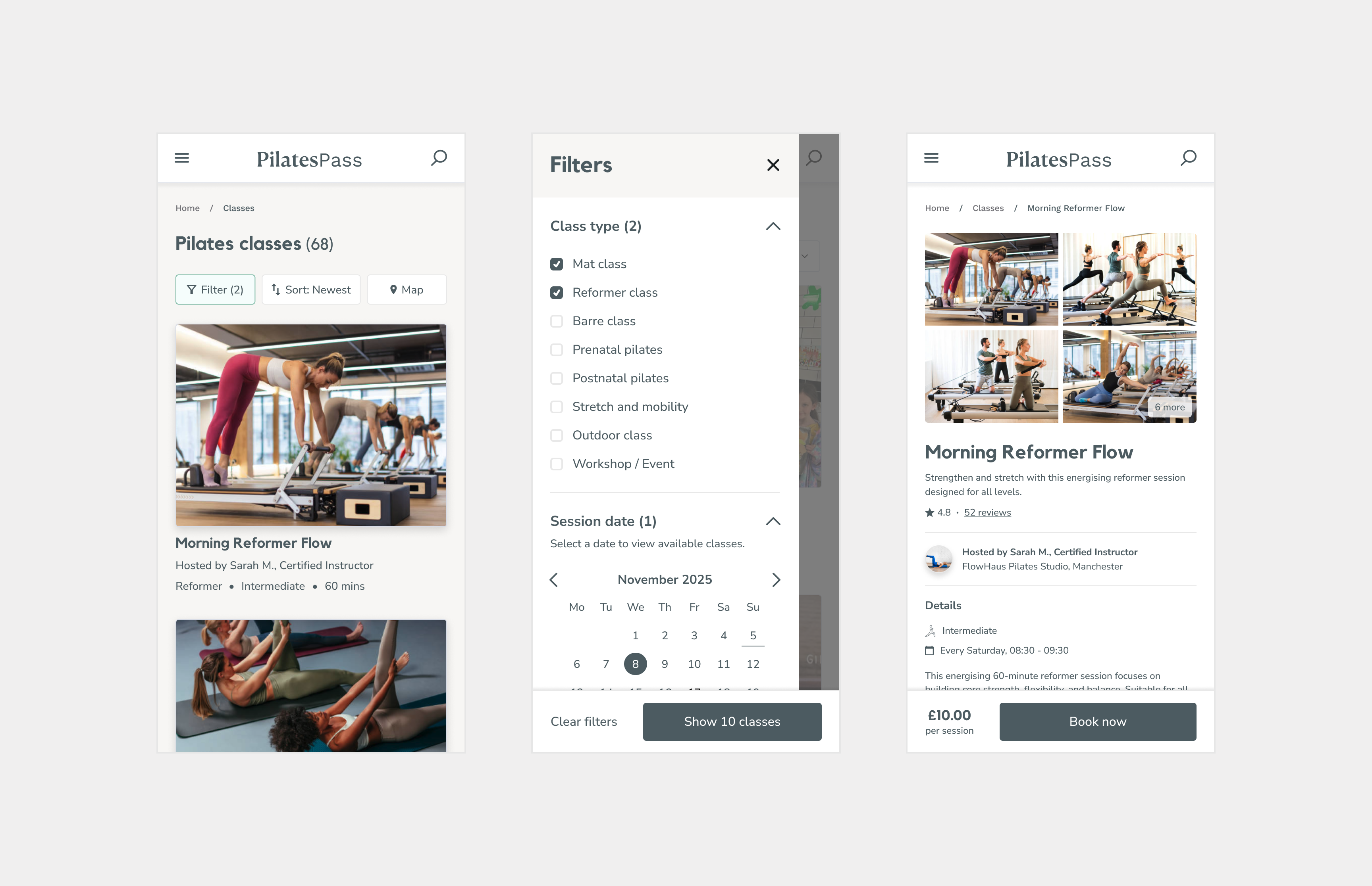
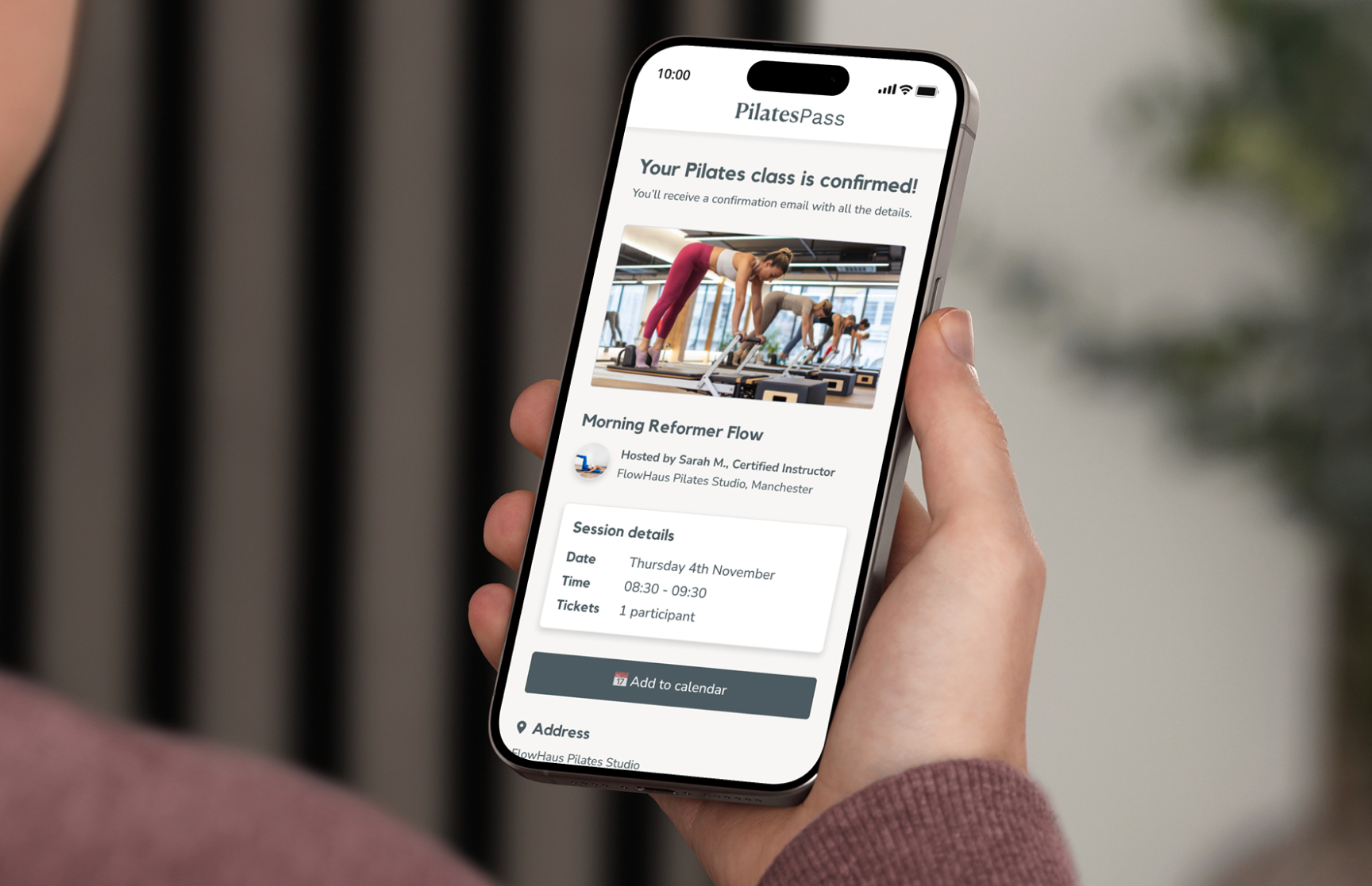
UI components such as calendars, pricing displays and confirmation states behaved differently depending on the service type. This made the experience harder to learn for clients and increased the likelihood of booking errors and support intervention.
Growing operational and engineering overhead
As the number of bookings grew, the founders were frequently stepping in to resolve booking issues or explain edge cases. Engineering velocity slowed as more time was spent maintaining variations rather than extending the product.
My concern was that each new booking method would increase complexity, slow delivery, and make the system harder to trust. Therefore, the platform needed a single booking model that could support flexibility without creating ongoing cost.
The approach
My approach focused on identifying and strengthening the structure underneath the booking experience, rather than optimising individual flows in isolation.
Revealing the common structure
I mapped every existing booking journey including group classes, private sessions, courses and workshops. I then compared where they genuinely differed versus where they had diverged unnecessarily over time. This revealed a single underlying flow hidden beneath multiple variations.
Designing for reuse
Instead of creating new flows for each service type, I defined a small set of reusable stages (such as availability, selection, pricing and confirmation) that could be combined in different ways depending on the booking type. This allowed flexibility without duplication, and made it easier for engineering to reason about the system as a whole.
Working in close partnership with engineering
I worked closely with engineering to understand which parts of the system were worth refactoring immediately and which could be addressed incrementally. We prioritised changes that reduced exception handling and unlocked faster delivery, while avoiding unnecessary disruption to instructors already using the platform. We sequenced the work to ensure we stabilised the core booking model first. Then we could focus on extending it with new formats.
Design strategy
My strategy was to reduce complexity by design. Instead of managing differences between booking types, I focused on defining how the booking system should behave in all cases.
One booking model, multiple configurations
I designed a single booking model that could be configured based on the offering, including group classes, private sessions and courses,. This allowed different service types to share the same underlying logic while still meeting instructor needs.
The key decision was to treat variations as configuration, not exceptions.

Predictable interactions across all bookings
Inconsistencies had crept in as new features were added. Calendars, pricing displays and confirmation states behaved differently depending on context, making the system harder to learn and trust.
I standardised these patterns so the same interactions behaved the same way everywhere. This reduced user error, increased confidence, and made the system easier for both users and engineers to reason about.
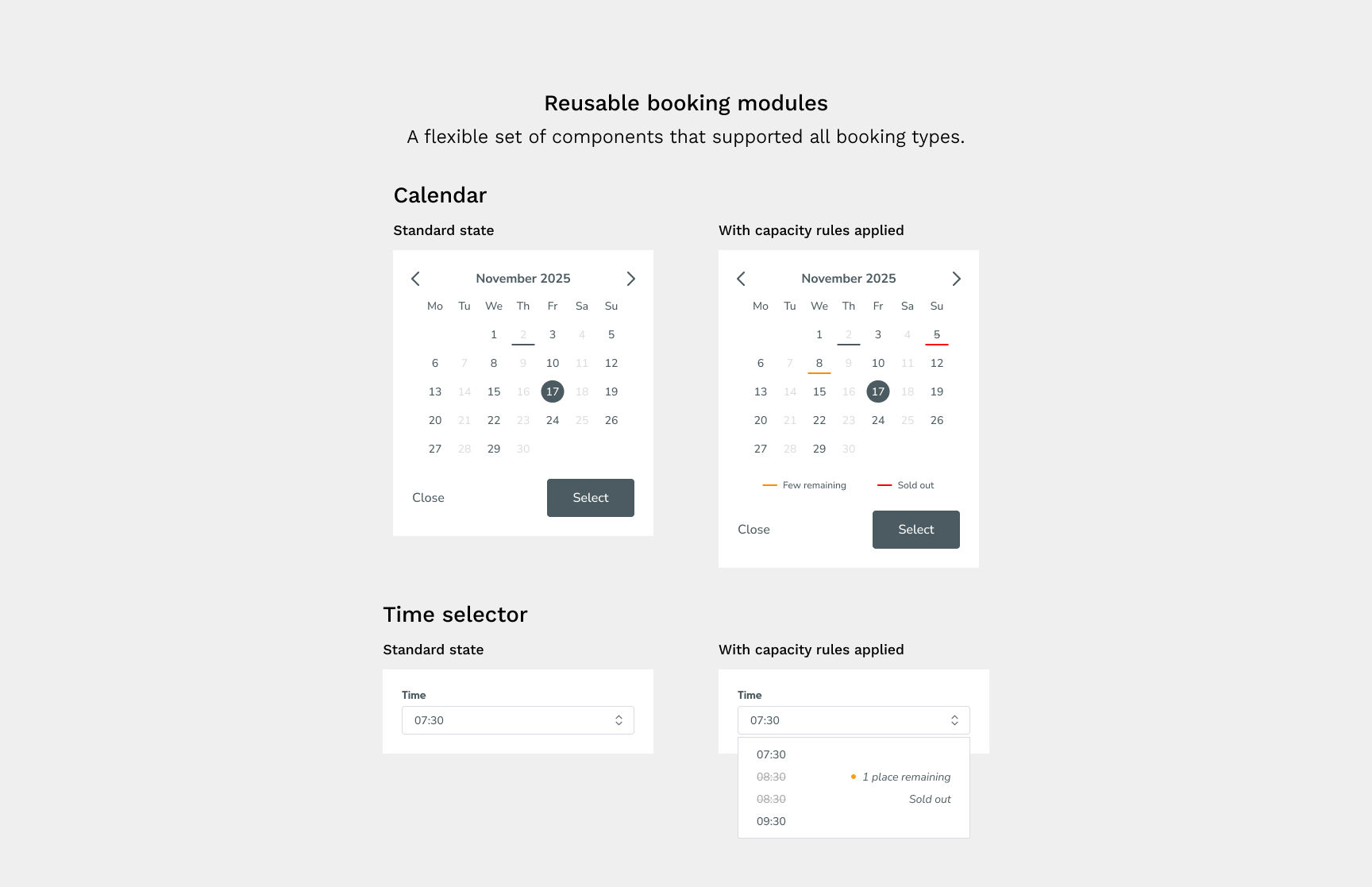
Designing components as system building blocks
Components were redesigned to work across scenarios rather than for individual screens. Calendars, pricing logic and progress indicators were built to scale across single sessions, multi-session bookings and bundles.
This reduced duplication and ensured new features could be introduced by recombining existing building blocks instead of starting from scratch.
Helpful system behaviour
Where certain combinations were not possible or required special handling, those rules were encoded directly into the booking flow. Instead of relying on manual fixes, the system guided users towards valid configurations and prevented errors early.
This reduced operational intervention and increased confidence for both clients and instructors.
Collaboration and influence
Stabilising the booking system required close, ongoing collaboration with the founders and engineering, particularly because the platform was actively growing while the work was underway.
Partnering with the founders
The founders were focused on supporting new service types and keeping instructors happy, which created pressure to add flexibility quickly. My role was to help step back from individual feature requests and focus on the underlying system.
I framed decisions around a longer-term view and how each new variation affected maintenance effort and future delivery speed. This helped us to align on the need to invest in a single booking model rather than continuing to add one-off solutions.
Working closely with engineering
I partnered with engineering throughout the project to understand where complexity had accumulated and how the system was being maintained day to day. Instead of handing over isolated designs, I shared flows, system rules and rationale early so we could reason about the architecture together.
This collaboration helped us to identify duplication across booking flows, reduce exception handling and prioritise refactors that unlocked faster delivery. By aligning on the structure first, we were able to improve the booking experience without disrupting instructors.
The outcome
The work shifted PilatesPass from a collection of one-off booking flows to a single, stable system that could support growth without increasing complexity.
A single, scalable booking system
Multiple overlapping booking journeys were consolidated into one shared model. New service types could be introduced through configuration rather than custom logic, reducing duplication and long-term maintenance costs.
More predictable booking for clients
Consistent interaction patterns, clearer validation and stronger system feedback reduced hesitation and confusion. Clients were able to book across different service types with confidence, without having to relearn the experience each time.
Reduced operational and engineering overhead
Fewer exceptions meant fewer booking errors and less manual intervention from the founder and support team. Engineering spent less time maintaining edge cases and more time delivering new features.
Faster rollout of new offerings
Because the underlying structure was already in place, new formats could be launched more quickly without redesigning or rebuilding the booking flow each time.
A stronger foundation beyond booking
The improved components and patterns were reused across search, scheduling and instructor workflows, increasing consistency across the wider product.
Measurement
We tracked booking-related support questions, instructor confusion during setup, time to implement new service formats, and booking completion behaviour. Across all areas we found fewer issues, faster delivery, and a booking system that felt stable and ready for scale.
The work directly supported the founders' ability to demonstrate product traction to investors. Over the course of the engagement, the platform secured £300k in investment — a raise that was underpinned by the progress made in the product.
Reflection
This project reminded me how quickly complexity compounds when systems grow through one-off decisions. What started as reasonable flexibility had slowly become structural drag.
The key to success was stepping back to identify the commonalities across the different booking types, and designing for reuse and predictability. The result was a booking system that became easier to use, easier to maintain, and easier to extend.