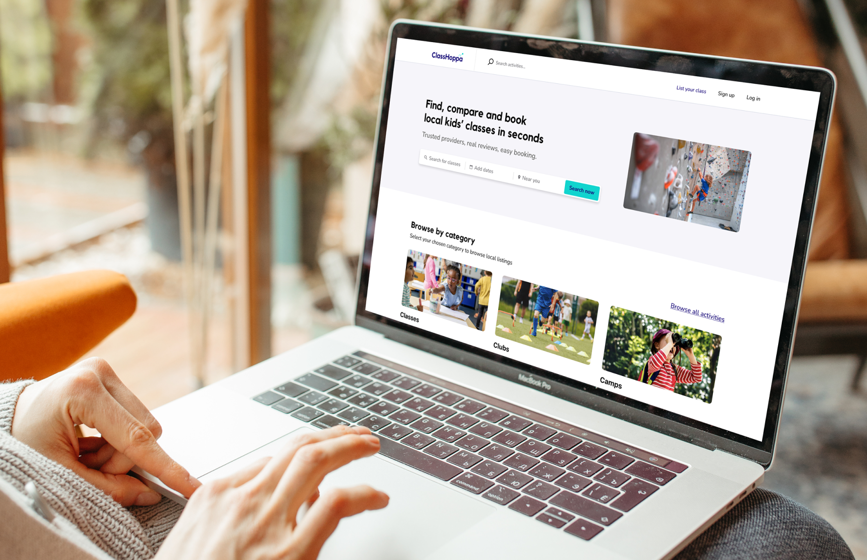

ClassHoppa is a UK-based marketplace that helps parents find, compare, and book children’s classes and camps. Their goal is to make discovering and booking children’s activities effortless, while also supporting local providers to reach new families and manage their bookings with ease.
From the beginning, I worked as part of a distributed team spread across time zones. We relied heavily on asynchronous communication through tools such as Figma, Trello, Discord, and Loom. This setup allowed for deep, uninterrupted work and thoughtful collaboration.
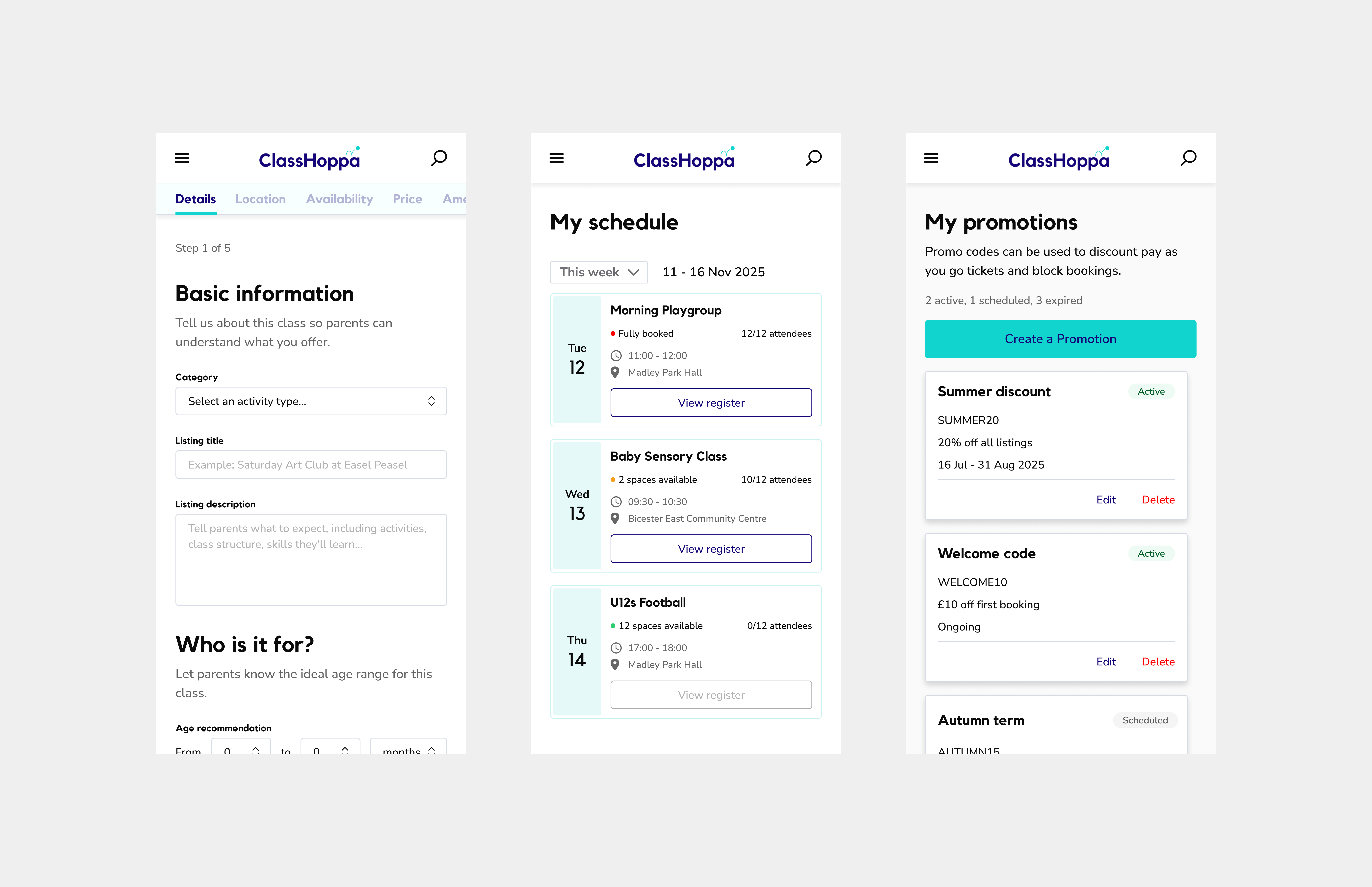
I led the design process from the earliest strategy sessions through to the final delivery of visual designs. This involved framing user needs, mapping core user flows, and refining every interaction detail before handoff. I partnered closely with engineering to maintain design quality throughout development, ensuring that our intent carried through to the live product.
Parents were struggling to find reliable and convenient ways to book activities for their children. Information was scattered across multiple websites, social media pages, and word of mouth recommendations. Booking and payment processes were inconsistent, and there was little reassurance about the quality or safety of providers.
For providers, the challenges were different but equally frustrating. Many small businesses lacked a professional digital presence. They needed a way to promote their classes, manage bookings, and communicate with parents without relying on manual processes or third party platforms that were not designed for their needs.
The design challenge was to create a single product that solved both sides of the marketplace — a seamless, trustworthy experience that felt effortless for parents and empowering for providers.
Our objectives were both strategic and user centred:
Each of these goals informed the structure of the product and the details of the design language. We wanted every interaction to feel simple, reliable, and human.
End to end design leadership
I owned the full design lifecycle from discovery to delivery. This began with mapping the problem space and running collaborative sessions to understand user needs and business goals. I created early journey maps and wireframes to define the product architecture and tested concepts with internal stakeholders before moving into detailed design.
Throughout the process, I championed design clarity and a strong sense of consistency across both user types. This meant developing interface components, layouts, and visual rules that could adapt easily to different use cases.
Remote and cross functional collaboration
Our team worked entirely remotely, which meant collaboration needed to be intentional and well structured. I established clear documentation systems and used asynchronous tools to share design updates and collect feedback.
I collaborated closely with the founders to align design direction with business priorities, with the product manager to refine flows and requirements, and with the engineering team to ensure designs were technically feasible. Regular design reviews and recorded walkthroughs helped maintain alignment and transparency across workstreams.

Data informed iteration
The founders conducted rounds of user testing with parents and providers, sharing insights and data with the team. I stayed close to this feedback, using it to refine user flows, simplify decision points, and make sure we were solving the right problems.
We treated the product as a living system, continually refining based on real behaviour and feedback. This approach helped us strike a balance between business objectives and user needs, and it shaped many of the micro interactions that made the experience feel thoughtful and dependable.
Collaboration and delivery
Working asynchronously with the founders and developers, I delivered annotated Figma prototypes and component libraries. This allowed engineers to build confidently while maintaining visual and functional consistency. We iterated weekly, validating flows through prototype testing with real parents and instructors.
ClassHoppa was a project that combined thoughtful design craft with deep collaboration. It challenged me to think about how trust is built through digital experiences and how two distinct user groups can be supported within a single cohesive system.
Working asynchronously in a remote team reinforced the value of clear communication and well structured documentation. It proved that strong design outcomes do not depend on proximity but on shared clarity and purpose.
This project stands out as one of my proudest collaborations. It’s not just about the final visuals but about the process, and how a small, distributed team worked together to deliver a marketplace that helps real families and small businesses thrive.

agile iteration / Systems thinking
Partnered with the founder, product, and engineering teams to design a fast moving B2B marketplace. Focused on system thinking, iterative delivery, and data informed decisions to create a cohesive, sustainable experience that evolves with the business.
View case study
scale / alignment / transformation
Redesigned an established B2B brand into a modern, two sided marketplace. Delivered system wide improvements across vendor tools, search, and dashboards, bringing teams together around a unified design vision and scalable design system.
View case study