Overview
Circulate’s buyers were motivated and ready to purchase, but often unsure whether they were making the right decision. Many products looked similar on the surface but differed in ways that had real implications for price, fulfilment and production.
As a result, buyers hesitated or sought reassurance before completing orders, the support team spent significant time assisting buyers, and the platform struggled to scale.
The business needed a system to help buyers make the right purchasing decisions.
The problem
I found three main issues driving buyer uncertainty:
Search results overwhelmed buyers instead of guiding them
Product cards surfaced large amounts of technical information, but without helping buyers distinguish what was important at the point of comparison. Critical attributes were buried alongside secondary details, making products harder to evaluate.
Listing pages lacked hierarchy
Information was densely packed and inconsistently structured. Buyers struggled to scan, compare, and understand which details were essential versus optional. This increased cognitive load and made it difficult to feel confident committing to a choice.
Checkout repeated decisions instead of reinforcing them
Buyers were asked to re-enter or reconfirm information they had already reviewed earlier in the journey. Rather than increasing accuracy, this repetition introduced doubt and raised concerns about making irreversible mistakes.
These issues created a system where buyers relied on the customer support team to feel confident proceeding. This situation would only worsen as the catalogue expanded.
Therefore, the main challenge was to improve decision-making for buyers. The product needed to guide buyers through complex choices and carry more of the operational responsibility itself.
Approach
My approach focused on understanding how buyers actually made decisions, then designing the system to support those decisions with the minimum necessary complexity.
Understanding where confidence broke down
I mapped the buyer journey from search to checkout, looking specifically for moments of hesitation. This included reviewing support messages, analysing search and checkout behaviour, and identifying where buyers paused, backtracked or contacted support.
This helped to establish the information buyers needed in order to make decisions, information that wasn't needed right away, and information that should never be optional.
Structuring complex product data
Circulate’s products carried a large number of attributes. Instead of exposing everything everywhere, I worked with the founder to group data by decision relevance — what mattered during comparison, what mattered during configuration, and what only needed confirmation at checkout.
This allowed me to introduce a clearer information hierarchy and reduce early cognitive load without removing essential detail.
Designing the system, not just the screens
From there, I defined the information architecture across search, listings and checkout so the system guided buyers through decisions in a predictable way. The focus was on reducing unnecessary variation, surfacing critical attributes earlier, and deferring secondary details until buyers were ready for them.
Working within constraints
Circulate uses Sharetribe, which required a pragmatic, constraint-aware approach. I partnered closely with engineering to reuse existing component patterns where possible, extend them only when necessary, and sequence work so improvements could ship incrementally ahead of the founder’s maternity leave.
This ensured we delivered progress quickly without compromising long-term scalability.

Design strategy
Rather than redesigning individual screens in isolation, I focused on defining how the system should behave when buyers were making important decisions.
Comparing search results
Search results were the first major decision point. This page was displaying too much undifferentiated information. The original thinking had been to show everything, but that increased confusion and overwhelm.
I made a deliberate call to prioritise a small set of key attributes, such as price, product dimensions, minimum order quantities and lead time, and defer secondary details. This helped buyers quickly rule options in or out without feeling overwhelmed, while encouraging deeper exploration into the products they were interested in.


Creating structure and hierarchy in listing pages
Listing pages had accumulated information organically over time, resulting in dense layouts that were difficult to scan. Instead of simplifying content, I focused on simplifying structure.
I reorganised listings into clear sections that moved from essential information into deeper technical detail, allowing buyers to progress at their own pace. This supported both experienced buyers, who wanted to move quickly, and newer buyers, who needed more reassurance, without duplicating logic or creating separate flows.


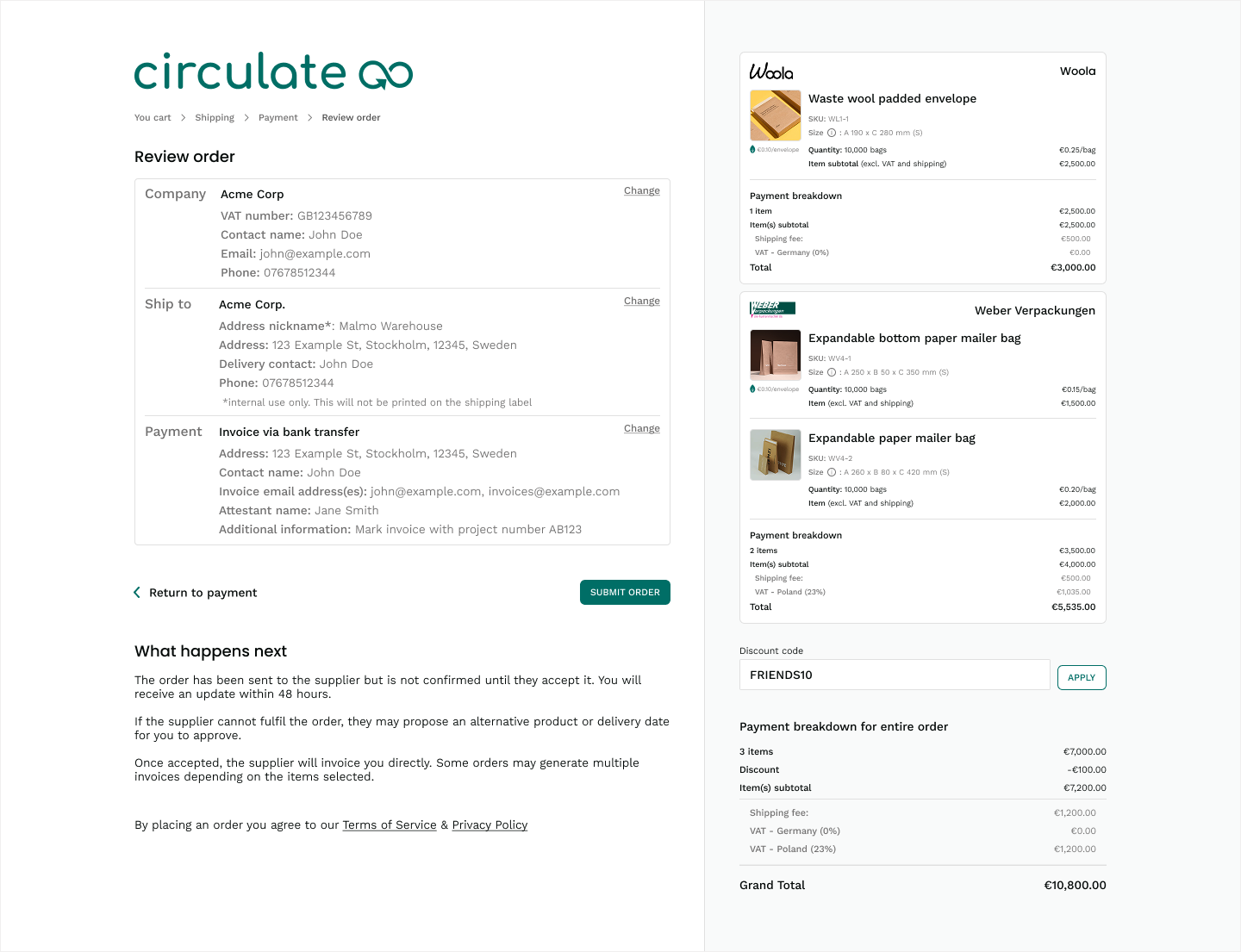
Reinforcing decisions during checkout
Checkout had become a source of doubt because buyers were asked to re-enter or reconfirm information they had already entered earlier. Rather than treating checkout as a final form, I reframed it as a confirmation step.
I redesigned the checkout journey as a guided, multi-step flow that validated inputs as buyers progressed and displayed only the fields that were relevant at that moment. This reduced repetition, prevented incompatible combinations, and reassured buyers that their earlier decisions were still correct.
Introducing helpful system behaviour
I designed empty states, status indicators and system rules that removed unnecessary friction. For example, when certain combinations of options were not allowed, the system explained why and showed what to do next. This helped buyers feel supported rather than blocked.

Extending components with restraint
Circulate’s foundation in Sharetribe meant working within an existing component system. Where patterns already existed, I reused them to reduce risk and speed up delivery. Where the experience required more structure, I designed new components deliberately and with reuse in mind.
This balance helped avoid unnecessary divergence while creating a more robust foundation for future complexity.
Collaboration and influence
This project required close alignment with a hands-on founder and a small engineering team, in a context where opinions were strong and operational pressure was already high.
Partnering with the founder
The founder had a clear long-term vision and was receiving frequent, often conflicting feedback from buyers, suppliers and support. There was pressure to keep adding features and information in response.
My role was to synthesise this input and ensure decisions reflected buyer behaviour rather than individual opinions. I consistently brought conversations back to where buyers hesitated, what drove support queries, and how that translated into operational cost. This helped us prioritise structural improvements over short-term additions, and agree on a more deliberate sequencing of work.
Working with engineering
I involved engineering from the outset to understand constraints within Sharetribe, existing data structures and where flexibility already existed. Rather than handing over static designs, I shared flows, system rules and decision rationale early.
This allowed us to reduce unnecessary variation, identify edge cases before implementation, and be intentional about when extending components was worth the cost. We also aligned on which improvements were foundations for the future versus what needed to ship immediately.
Outcomes and impact
The redesign resulted in approximately a 20% improvement in conversion rate, which a meaningful result both operationally and and commercially.
Faster, more confident product discovery
Buyers were able to rule products in or out more quickly because search results and listing pages surfaced the information that mattered most at each stage. This reduced hesitation and made comparison easier, even across products with subtle but important differences.
Reduced reliance on customer support
By guiding decisions more clearly and preventing incompatible selections, buyers no longer needed to contact support for reassurance as frequently. Support queries during search and checkout dropped, freeing up time for the team to focus on higher-value work.
Clearer, more reliable checkout
The guided checkout flow reinforced earlier decisions instead of reopening them. Built-in validation reduced errors and helped buyers feel confident that their selections were correct before committing.
A more scalable system
The platform became easier to maintain and extend. New products and attributes could be added without increasing confusion or operational overhead.
The system carries more of the load
Previously, confidence lived with the support team. After the redesign, it lived in the product. Buyers were able to complete complex purchases independently, and the business was no longer dependent on human intervention to scale.
Measurement
We monitored patterns in support queries, buyer hesitation during checkout, and feedback from repeat purchasers. Across all three, the trend was consistent: fewer questions, smoother completion, and greater confidence, particularly for first-time buyers navigating complex orders.
Reflection
This project reinforced how easily complexity can accumulate when a system grows without clear structure. In environments with dense product data, clarity comes from guiding decisions deliberately.
The most important part of the redesign was in deciding where complexity belonged, when it should be revealed, and when the system should take responsibility instead of the user. By focusing on structure, hierarchy and system behaviour, we were able to reduce uncertainty without oversimplifying the product.
Circulate was a strong example of the kind of problems I enjoy working on: complex systems where good design reduces risk, supports scale, and makes difficult decisions feel manageable for users.